Now we see the gray surface color where the light from the light source falls directly on the sphere but the shaded side is still absolutely black. Now let's change diffuse to 0.3 and ambient to 0.3.
The sphere now looks almost flat. This is because we have specified a fairly high degree of ambient light and only a low amount of the light coming from the light source is diffusely reflected towards the camera. The default values of ambient and diffuse are pretty good averages and a good starting point. In most cases, an ambient value of 0.1 ... 0.2 is sufficient and a diffuse value of 0.5 ... 0.7 will usually do the job. There are a couple of exceptions. If we have a completely transparent surface with high refractive and/or reflective values, low values of both ambient and diffuse may be best. Here is an example.
This is glass, obviously. Glass is a material that takes nearly all of its appearance from its surroundings. Very little of the surface is seen because it transmits or reflects practically all of the light that shines on it. See glass.inc for some other examples.
If we ever need an object to be completely illuminated independently of the lighting situation in a given scene we can do this artificially by specifying an ambient value of 1 and a diffuse value of 0. This will eliminate all shading and simply give the object its fullest and brightest color value at all points. This is good for simulating objects that emit light like lightbulbs and for skies in scenes where the sky may not be adequately lit by any other means.
Let's try this with our sphere now.
Rendering this we get a blinding white sphere with no visible highlights or shaded parts. It would make a pretty good streetlight.
Rendering this we see a fairly broad, soft highlight that gives the sphere a kind of plastic appearance. Now let's change phong_size to 150. This makes a much smaller highlight which gives the sphere the appearance of being much harder and shinier.
There is another kind of highlight that is calculated by a different means called specular highlighting. It is specified using the keyword specular and operates in conjunction with another keyword called roughness. These two keywords work together in much the same way as phong and phong_size to create highlights that alter the apparent shininess of the surface. Let's try using specular in our sphere.
Looking at the result we see a broad, soft highlight similar to what we had when we used phong_size of 25. Change roughness to .001 and render again. Now we see a small, tight highlight similar to what we had when we used phong_size of 150. Generally speaking, specular is slightly more accurate and therefore slightly more realistic than phong but you should try both methods when designing a texture. There are even times when both phong and specular may be used on a finish.
We see that our sphere now reflects the green and white checkered plane and the black background but the gray color of the sphere seems out of place. This is another time when a lower diffuse value is needed. Generally, the higher reflection is the lower diffuse should be. We lower the diffuse value to 0.3 and the ambient value to 0.1 and render again. That is much better. Let's make our sphere as shiny as a polished gold ball bearing.
That is very close but there is something wrong with the highlight. To make the surface appear more like metal the keyword metallic is used. We add it now to see the difference.
We see that the highlight has taken on the color of the surface rather than the light source. This gives the surface a more metallic appearance.
The degree of refraction, i. e. the amount of bending that occurs, is given by the keyword ior, short for index of refraction. If we know the index of refraction of the substance we are trying to create, we may just use that. For instance, water is 1.33, glass is around 1.45 and diamond is 1.75. Let's return to the example of a glass sphere we used earlier.
We render this again and notice how the plane that is visible through the sphere is distorted and turned upside-down. This is because the light passing through the sphere is being bent or refracted to the degree specified. We reduce ior to 1.25 and re-render. We increase it to 1.75 and re-render. We notice how the distortion changes.
This gives the sphere a slightly clouded look as if not all of the light was able to pass through it. For interesting variations of this texture, try lowering ior to 1.15 and raising reflection to 0.5.
Once we know what we are looking for we will be able to spot caustics in many everyday situations: the shadow cast by a magnifying glass has one, light streaming through an aquarium might makes them, the light passing through a piece of crumpled cellophane might cast them on the table top, etc. We will even see them in the bottom of a swimming pool on a bright sunny day. Caustics are a subtle lighting effect that can really lend realism to raytraced images of such items.
POV-Ray uses algorithms that fake refractive caustics (reflective caustices are not possible).There are inherant limitations on the process of (standard) ray-tracing in general which make it unsuitable for certain light simulation applications, such as optical testing and a few very particular architectural lighting projects. Methods which do the considerably more extensive calculations needed to do full light simulation including caustics (like path-tracing, photon-tracing or bi-directional ray-tracing) are very slow and impractical on average platforms.
This means that we have to tinker with the caustics to get the best possible look, but with a little experimentation, we will see we can very closely emulate the real thing. The best way to go is, where ever possible, to study an example of the thing we are trying to trace. We need to get to know its pattern of caustics and then adjust our final picture until we are satisfied.
When we render this we will see our sphere in the upper right corner of the image, floating a little over the plane, and the shadow it casts is sprawled across the central part of our view. And there in the center is a basic caustic. That bright area in the center represents the light which normally refractivity would concentrate in the middle of the shadow.
The only question this leaves is: what is with the floating point value which follows the caustics keyword? Well, that's where our discussion above on adjusting the caustic comes in. Remember the drinking glasses? If we had one that had fairly thin walls and then a thick glass base we will see what we mean in the shadows it casts. Above, with the thinner walls (with less refraction) the caustics are less pronounced and more evenly diffused through the shadow, but when we get to the part of the shadow cast by the thicker, more refractive base, suddenly the caustic becomes more pronounced and more tightly focused near the center.
Of course, since this is a simulated caustic, there is no correspondence between the degree to which the caustic is focused or diffused and the shape, size and refractivity of the object. But we can manually control it with the floating point value following the caustic keyword. The closer this value gets to zero, the more diffused and dimmer the caustic gets, while the nearer it becomes to 1, the more tightly focused and pronounced the caustic gets. At 1, we have the caustic of a thick, highly refractive piece of lead crystal, while at 0.1 it is more like a hollow glass sphere. We try this by re-rendering the above scene, with a range of values from 0.1 to 1.0 and watching the different caustics we get.
Out of range values work also. Numbers higher than 1 just lead to more and more tightly focused caustics. Negative numbers are just plain weird, but interesting. Essentially, the object becomes illuminated in all sorts of bizzare ways and the shadow becomes like a photographic negative of itself. Kind of like a 1950's sci-fi raygun effect. It looks strange, and not at all photo-realistic, but if we like the surreal we may want to try it at least once and file away the effect in our mind in case we ever want it.
Section 4.8.4.2
Using Surface Highlights
Section 4.8.4.3
Using Reflection and Metallic
Section 4.8.4.4
Using Refraction
Section 4.8.4.5
Adding Light Attenuation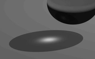
The caustics of a translucent sphere.
Section 4.8.4.6
Using Faked Caustics
Section 4.8.4.6.1
What are Caustics?
Section 4.8.4.6.2
Applying Caustics to a Scene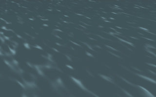
The caustics in a swimming-pool.
Table Of Contents